You must have seen tactile paving. These are the brightly colored (usually yellow and/or red) tiles you will see on pavements, metro, underground, subway, bus and tram stations and other public places. Marked with little bumps and ridges, these tiles would be installed in any place that claims to be accessible for the persons with visual impairment.
However, sighted people hardly know significance of these tiles. Most people think that these tactile tiles are used for decorative purpose! The truth is that these tiles serve as a navigation guide for visually impaired people. These tiles serve to enhance accessibility of a place. Although for most people these tiles may look mundane — but for blind people these tactile tiles play a great role in their daily life.
Did you know that various patterns embossed on these tiles actually have a specific meaning?! Well, in this article we are going to discuss the meaning of tactile pavings and how these are useful for blind people.
Trivia: Tactile paving was first developed in Japan by Seiichi Miyake in 1965. In Japanese these tactile tiles are called Tenji blocks. These blocks were first used in Okayama City in 1967. Such blocks are also called truncated domes.
How Tactile Tile Paving is Useful for Blind Persons?
First of all, let’s talk about the color of tactile tiles. Only a small percentage of persons with visual impairment can not see anything at all. Most persons with visual impairment have some degree of sight. This is the reason tactile tiles are made in bright colors like yellow and red. These colors are easier to be seen by partially-sighted people.
Also, red titles are often used for indicating a controlled crossing. For example, you will see red colored tactile tiles on crossings where there is a traffic and/or pedestrian light available. This indicates to the partially-sighted person that she can use pedestrian light to cross the road. Yellow colored tactile tiles are used for uncontrolled crossings.
Persons with visual impairment use a cane to feel the path in front of them. When cane touches these patterned tactile tiles, the bearer gets various types of information on how to navigate the way ahead.
Meanings of Patterns on Tactile Paving
Different countries may have slightly different guidelines for the use of tactile flooring — but mostly these titles carry a similar meaning.
Tiles with Parallel Blister Lines
Tiles with embossed flat-topped blisters in a square pattern are used to indicate that there is a road crossing.
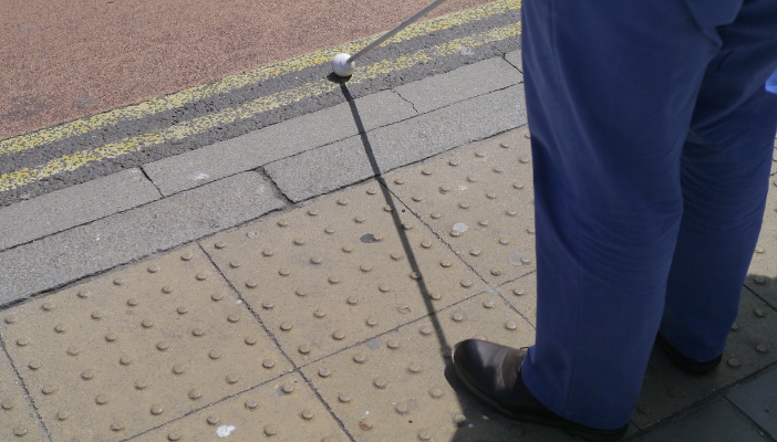
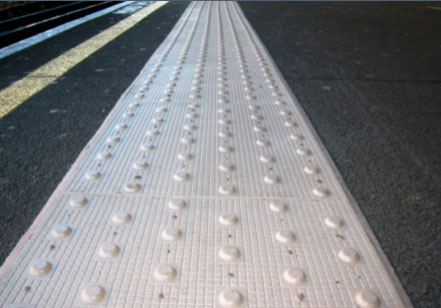
Titles with Offset Blisters
These tiles indicate that there is a train platform ahead. If one is not careful, she might fall into the ditch. Such tiles can be used to indicate a sudden level change.
Titles with Across Stripes
Placement of these tiles show that there are stairs or some other hurdle ahead. Be careful. These tiles are also called corduroy hazard warning tiles.
 Places where these tiles are often used include:
- The top and bottom of stairs
- At the foot of a ramp
- At level crossing
- Where people may unintentionally walk directly on to the platform at a railway station
- Where a footway joins a shared route
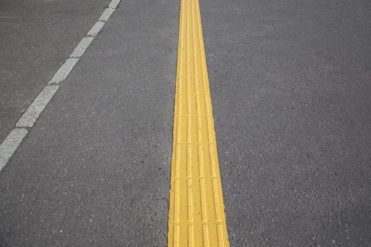
Tiles with Along Stripes
These tiles indicate that it is safe to keep going ahead. The path has no hurdles and it’s safe.
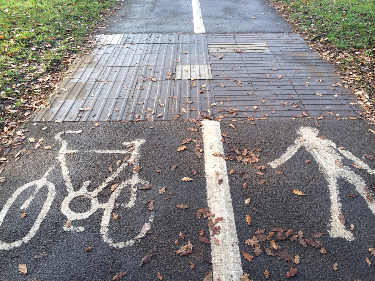
A combination of both across and along stripes is often use when there are two types of path laid together. One of these paths would be for pedestrians whereas the other side would be, for example, bikes. In such cases, tiles are laid along the bike path and across the pedestrian path.
Lozenge-shaped Tactile Tiles
These tiles warn the blind people that they are approaching the edge of an on-street transit line (e.g. a tram line).
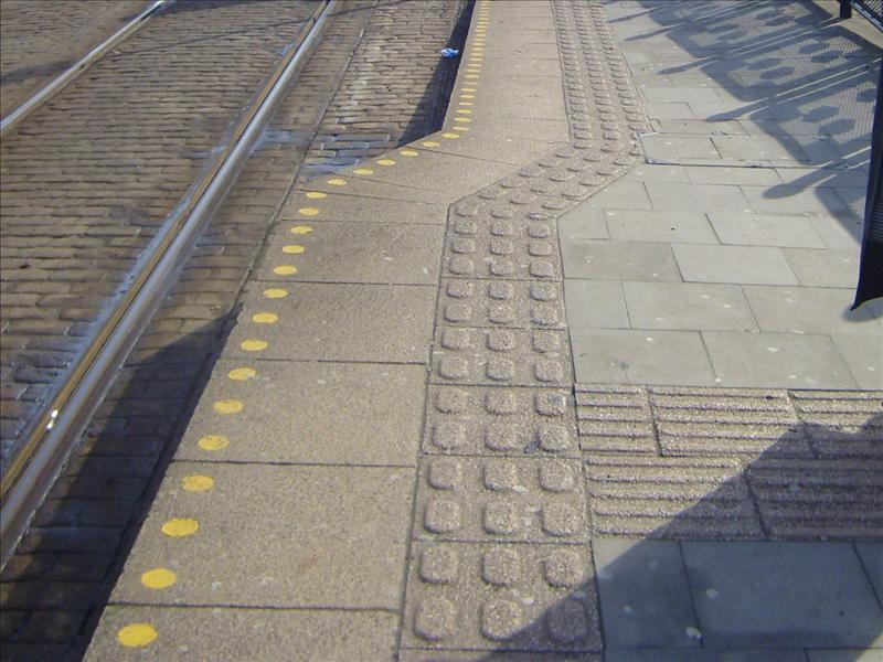
So, now you know the meanings attached to various types of tactile tile. Different types of these tiles can be combined to create an easily and independently accessible tactile path for for blind and partially sighted. Here is an example of a tactile path that is using various tiles:
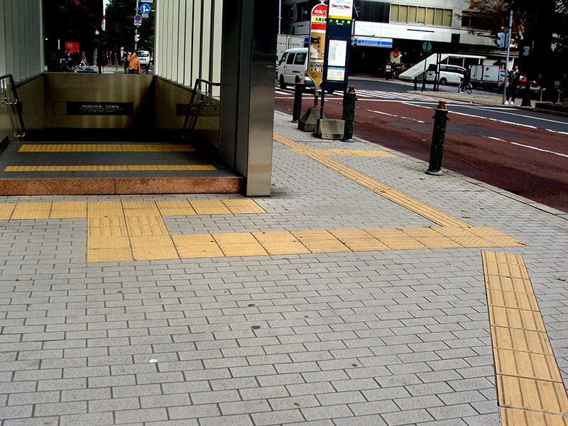
We hope that the next time you will look at these bumpy tiles, you would remember that they serve a very important role. Tactile surface helps blind and partially sighted people a lot in finding their way around. If you have anything to add to this article, I would be glad to take your contribution. Please use the comments sections for giving your input. Thank you for using WeCapable!
Use the citation below to add this article to your bibliography
"Meanings of Tactile Paving: A Blessing for Persons with Visual Impairment." Wecapable.com. Web. April 26, 2024. <https://wecapable.com/tactile-paving-tiles-meaning-blind-persons/>
Wecapable.com, "Meanings of Tactile Paving: A Blessing for Persons with Visual Impairment." Accessed April 26, 2024. https://wecapable.com/tactile-paving-tiles-meaning-blind-persons/
"Meanings of Tactile Paving: A Blessing for Persons with Visual Impairment." (n.d.). Wecapable.com. Retrieved April 26, 2024 from https://wecapable.com/tactile-paving-tiles-meaning-blind-persons/

Do you recommend tact tiles in stairways for blind people where no passenger lifts are not provided. I need to get an opinion for tact tile arrangement in subway stairways in railway stations. Your quick response is highly appreciated.
In short, yes, there should be tact tiles in stairway. However, it depends on many factors, like width of the stairs, availability of side rails etc. Tact tiles should also be used at the beginning and end of the stairs so as to inform the user what to expect next. If you’re working on a critical project, please consult a few blind users and take their opinion as well.
Thank you so much for this information. I never realised that there was a real meaning in these tactile tiles. I’m in a wheelchair and often curse them – makes my ride extra bumpy! – but now I will appreciate the tiles’ messages.
I’ve just discovered your website and although much of the information will not be useful to me (I live in Perth Australia) I am having fun discovering information and videos on your site!
Thanks for this. It has been surprisingly difficult to find a simple explanation of the different tilings with visual references on the web.