You might already be aware that the Paralympic Games are the counterpart of the Olympics for persons with disabilities. The logo of the Olympics is already quite popular. In this article, we will give you details about the logo of the Paralympics.
What Does Paralympics Logo Looks Like?
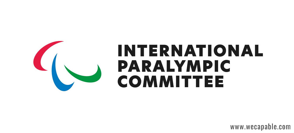
Paralympics logo i.e. the symbol of Paralympic games comprises three ‘agitos’ coloured red, blue and green. The three agitos seem to encircle a single invisible point on a white field. ‘Agito’ is a Latin word that means ‘I move’ and the symbol looks like an asymmetrical ‘crescent’ or the ‘sickle moon’.
What does the Paralympics logo represent?
A logo is not just a graphic; it contains the message of the brand it represents. The Paralympics logo is no exception. The crescent design, the colour palettes as well as the placement of the crescents with respect to each other has certain meanings.
The three crescents or agitos encircling a centre point signify motion and the role of the International Paralympic Committee in bringing together athletes with disabilities from all corners of the world and enabling them to compete with sportsman spirits. The logo is also the symbol of Paralympics’ motto – ‘Spirit in Motion’ that represents the strong will of every Paralympian.
The three colours used in the Paralympics logo (apart from the white background) i.e. red, blue and green are the most widely used colours in national flags of countries all around the world. This colour palette has been in use by the Paralympic games since 1994. In addition to being representatives of national flags, these colours have some side meanings too. Red stands for passion and strength. Blue is the colour for protection and reliability. And, green symbolizes progress, growth and success.
History of the Paralympics Logo
The Paralympics logo was not always like described above. The logo has undergone several phases of evolution before reaching its current form. Let us give you a glimpse of the development phases of the Paralympics logo.
1988-1994
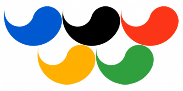
The logo designed for the Paralympic games of 1988 was very different from the current logo. The logo consisted of five petals that looked more like horizontally placed drops with thinner sides curved up. Three petals were arranged atop two petals. The colour palette was similar to the Olympic rings – blue, black, red, yellow and green. The petals were arranged similarly to the Olympic rings – blue, black and red over the yellow and green petals.
1994-2004
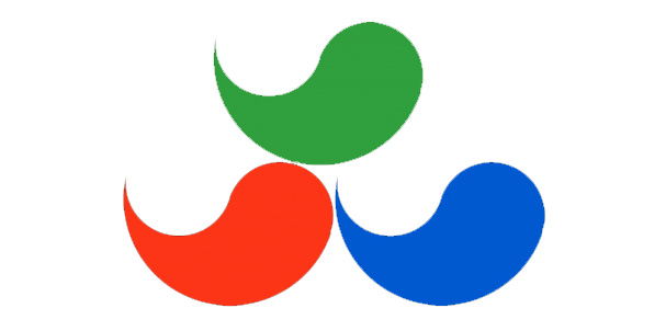
The redesigned logo of the Paralympics reduced the number of petals from five to three. In the new design, a green petal rested over the red and blue petal. The redesigning was probably done to make the Paralympics logo stand out from the Olympic logo. The number of elements, as well as colours, were reduced.
2004-2019
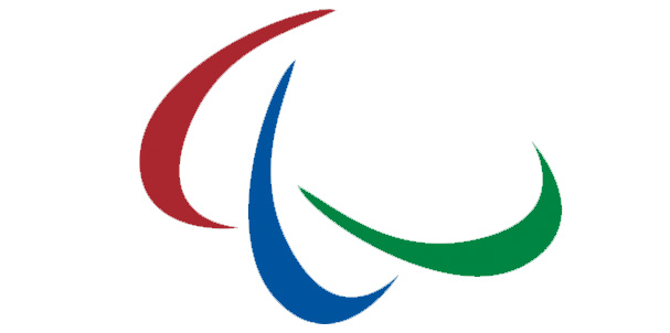
The logo redesigned in 2004 retained the previous colour palette but all three colours were darkened to make them look more stable and confident. The new logo also consisted of three elements but they were no more petals or horizontally placed drops with curved up thinner sides. The new elements were shaped like crescents but asymmetrical one. The elements were no more stacked over each other. They were rather placed one after other to symbolize motion and dynamics – the purpose and spirit of games.
2019 on wards
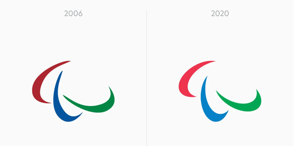
The Paralympic logo being used in the 2020 Tokyo Paralympics is the modified version of the logo used till 2019. Some minor changes have been done to the existing logo. The three colours have been brightened up to make it more welcoming. The crescents or the agitos have been placed with more spaces in between for creating a sense of freedom and lightness. The three crescents are now the same and are based on strict geometry.
Use the citation below to add this article to your bibliography
"Paralympics Logo: Meaning and History." Wecapable.com. Web. October 22, 2024. <https://wecapable.com/paralympics-logo/>
Wecapable.com, "Paralympics Logo: Meaning and History." Accessed October 22, 2024. https://wecapable.com/paralympics-logo/
"Paralympics Logo: Meaning and History." (n.d.). Wecapable.com. Retrieved October 22, 2024 from https://wecapable.com/paralympics-logo/

Leave a Reply